How to Write a Covering Letter for a Short Story Submission
October 09, 2026 - Fiction

October 09, 2026 - Fiction
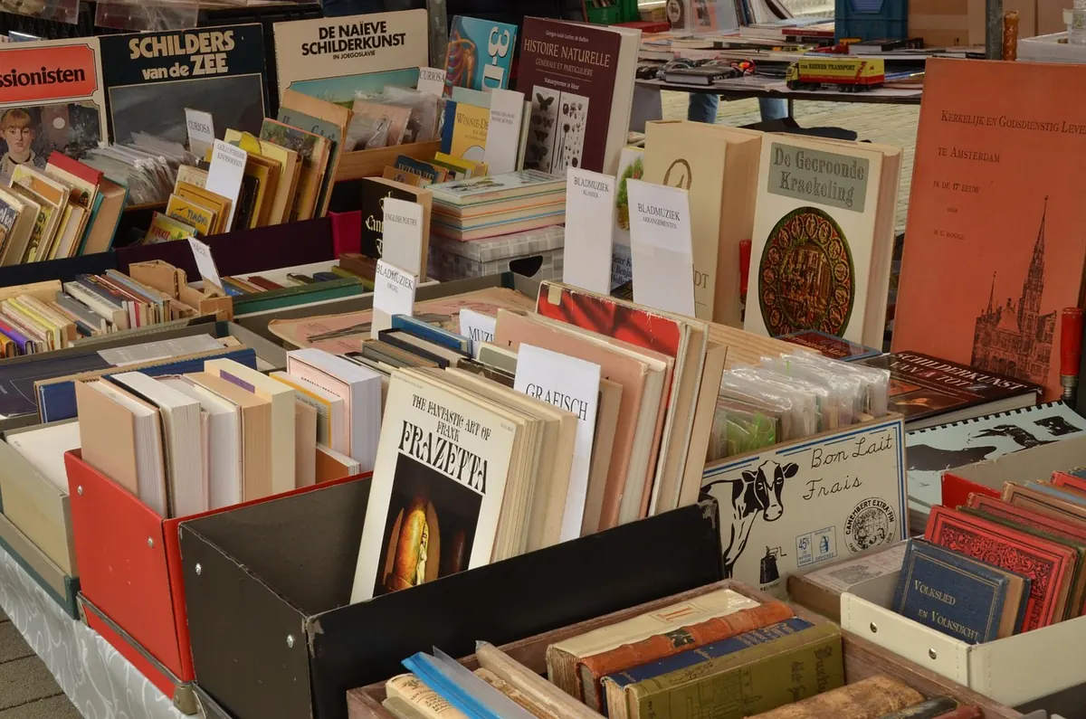
Most art books are bought on impulse and regretted slowly. The cover is beautiful; the pages inside are grey, the spine gives up within a year, and the “limited edition” turns out to be a trade run with a numbered sticker. None of that is bad luck. It is what happens when a book is judged as a set of pictures rather than as an object. Here is what to look at, roughly in the order that matters, before you spend serious money.
A limited edition is a promise about paper, ink and time. The limitation page is only the receipt.
A well-made art book usually uses coated stock — matt, silk or gloss — because a coated surface holds ink on top of the sheet instead of letting it sink in. That is what gives plates their depth and their clean edges. Uncoated paper does a different job: it suits letterpress, duotone and books where texture matters more than shine. Neither is automatically better, but the wrong choice shows at once.
Weight matters less than opacity. A 150 gsm sheet you cannot see through is worth more than a heavier one you can. Hold a page up to a lamp. If the image on the reverse shows through, every double-page spread in the book will be fighting itself.
Look at the shade of the paper, too. A creamy, warm white flatters black-and-white photography but pushes every colour plate towards yellow. Where colour accuracy counts, hold the page edge against a sheet of true white and decide how much warmth you are willing to accept.
Two bindings matter here. Perfect binding glues the pages into a flat spine. It is cheap, and on a heavy art book it will eventually fail, usually at the page you return to most. Section-sewn binding — often called Smyth-sewn — sews the pages into folded groups before the spine is attached. It opens flat, survives years of use and can be rebound if it ever needs it.
Above that, look at the case: full cloth, quarter-bound with a cloth spine and paper boards, or a printed paper case. Cloth wears better and ages better. Check the joints, the hinges where the boards meet the spine. Open the book at the middle, then near the front, then near the back. A faint creak is fine. A crack is not.
Then check the details marketing copy rarely mentions: head and tail bands, a ribbon marker that sits properly, endpapers thick enough not to split, and a slipcase that fits snugly rather than sliding off. If the boards are already warped on the seller’s table, walk away. Warping seldom corrects itself.
A good printer holds detail in the darkest areas — the folds in black fabric, the gaps between stones, the texture inside a printed shadow. If those areas are solid and featureless, the plates were printed too heavily or made from weak scans. Check skies and skin tones for banding. Smooth gradients should be smooth.
Fine black type printed over a colour field should stay crisp. If it looks soft or slightly out of register, the press work was rushed. Halftone dots should disappear at normal reading distance and resolve into a neat pattern only when you lean in. A coarse rosette visible from a foot away means a low screen ruling.
Where you can, compare a plate with another reproduction you trust, or with the original print. If the seller has two copies, compare them. Editions vary, and the variation tells you how much care went into the run.
A limitation page — sometimes called a colophon — should state the total number of copies, whether they are numbered, and whether they are signed. You may also see states: a standard edition, a deluxe edition on heavier paper, a small lettered run, occasionally with an original print bound in.
Do not assume small is better. A signed run of a thousand copies, printed beautifully on good stock, is a better book than a run of a hundred printed badly. What matters is whether the edition is genuinely closed and honestly described.
Ask directly:
“Limited” appears on a great many books that were limited only by the publisher’s optimism. A second printing inside a limited edition is a contradiction in terms.
Provenance is the story of where a copy has been. In art books it usually means a documented link to the artist or the publisher: a hand signature, an estate stamp, a publisher’s blind stamp, a tipped-in plate, an original etching or lithograph bound in as a frontispiece, a numbered print recorded on the limitation page.
Keep the paperwork. An invoice, a dealer’s receipt, an auction condition report, an exhibition label, even a previous owner’s bookplate all add to what a copy is and how it can be described later. Completeness counts as well: a missing slipcase, dust jacket, errata slip or loose folding plate can be hard and costly to replace.
Buy from sellers who describe condition plainly and will answer questions about a specific copy. If the sum is significant, ask for photographs of the limitation page, the signature, the joints and any faults. A reputable dealer will send them without fuss.
Before you commit, run through this:
Once it is yours, look after it. Keep books out of direct sunlight and away from radiators and damp walls, and store them upright rather than stacked flat. Handle heavy volumes with clean, dry hands and support the spine when you open them. A slipcase protects the boards; a jacket protects the cloth. Both are worth keeping.
And if a copy is expensive enough to feel like an investment rather than a pleasure, treat it that way from the start: inspect before you buy, keep every piece of paper that came with it, and take proper advice on insurance and valuation from someone qualified to give it.
Photo: MrsBrown / Pixabay
A practical guide to writing the covering letter UK magazine editors actually want: structure, tone, credits, bio,...
A practical guide to preparing, pacing and performing poetry aloud, with advice on microphone technique, page layout...
Copyright © 2026 Muse Press. All Right Reserved.